Layers AKA Pain
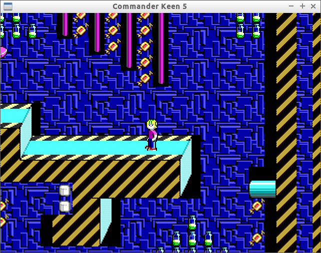
A few posts ago I mentioned how I probably won’t get around to filling in the empty black spaces that you see all over the place. To recap, these black spots occur because I only paint one layer of tiles. In some cases, the drawn part of a tile only occupies part of the tile, and, combined with the fact that I’m only drawing one layer, you don’t see the background behind the tile; you just see empty space.
Before:

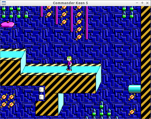
After:

Since this is purely cosmetic and obviously required lots of tedious editing to both my level editor at the game itself, I never thought I’d get around to it. I changed my mind because, while I personally don’t really care about how the game looks, it did make the game feel significantly less like a game, so I decided it was worth fixing.
Fix Attempt 1: The Lazy Way
I knew ahead of time that adding layer support to my already crappy level editor would be a nightmare. I’m also not a fan of the idea of drawing multiple layers of tiles every frame in a game when only a few are needed. I know modern computers can handle it, but I don’t like needless waste.
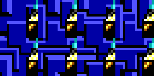
Because of this, I first tried to keep it as one layer and add more tiles to the sprite sheet such that each partial tile had background behind it. This quickly became problematic because of the repeating 8-tile background. For most “partial” tiles, this meant adding 8 tiles with each variation of the background tiles behind it. I figured this was fine for a few tiles but then later I realized there were more like 20 partial tiles. This was way too much work. This was especially fun for partial tiles that weren’t perfect rectangles but instead were more triangular. For those (and there were way too many) I had to hand draw each section of the background behind the partial tile. Below is a screenshot of one of these tiles.

Alright, so that was terrible. What’s next?
The Level Editor
…
It’s probably a bad sign when you hate your own code.
As I’ve mentioned before, my level editor was written in a hurry and I avoid making modifications to it like the plague. For the scope of this change, I considered basically rewriting the XAML. I know very little about WPF layouts, but I briefly looked into alternatives to my StackPanel layout and into Canvas and Grid layouts to see if they could better suit my needs. Right now I have a bunch of buttons arranged alongside each other to represent the level. The problem with buttons is that you can’t draw one button’s background on top of another button’s background; it gets completely replaced. This would be possible with an image instead, but images lack other functionality (like selection) that I need. I didn’t bother taking the time to figure out the best way to do what I want in WPF because, frankly, I have no interest in mastering WPF at the moment. Instead, I took the plunge with my current button-based layout.
Most of the details probably aren’t worth going into. The main steps of this change were to add a layer of buttons for as many layers as specific, then add the ability to save/load these extra layers. One consequence of this was that I ended up changing the format of the file the level editor spits out. This wasn’t necessary and it added a lot of work, but it’s something I wanted(?) to do.
The New File Format
My first level has 3 layers. One background layer, where the tiles do nothing but get drawn, then two foreground layers: one drawn behind the player, one drawn in front of the player. With my old file format, this meant three mostly-redundant layers. The level has nearly 4000 tiles in it. This meant almost 12,000 lines in the file that were largely redundant. While not necessary to fix this, it annoyed me, so I fixed it. Yes, this IS premature optimization. Were this my job, I…well, okay, the product would be much better to begin with, but I wouldn’t have bothered with something like this. I consider this a learning experience so that I can see both sides.
The new file format has the concept of one line per location, rather than one line per tile. This means that no matter how many layers are in the level, there’s only one line per “spot”. The main consequence of this is that now the number of tiles that show up on each line may change with the level. I also added an additional optimization that hides some unnecessary data if there are no tiles on a given layer. Other than that, the format is practically unchanged. Still, it sent me for a loop for quite awhile in my level editor and I’m very glad to be done with it.
The Sprite Sheet
Back to the tiles themselves. While I’m eternally grateful that the sprites have been provided online for free, I’m not so happy with their layout. In the case of the player sprites, they weren’t aligned to tile sizes, so I had to manually space them out such that I could iterate over them. In the case of the tiles themselves, they had a nice black background…wonderful…oh wait, I need to make their empty space transparent somehow! For this I decided to use the color red (FF0000) to indicate a transparent color. SDL has an easy way of making a certain color transparent. I chose red because it doesn’t appear in the game anywhere.
Previously I didn’t need to bother filling empty space with red because I didn’t need to draw over the empty space. Now I do. So, I had the wonderful privilege of hand-drawing over several tiles with red. As mentioned before, this was especially fun for tiles that aren’t rectangular as I got to figure out where the tile ended and where the empty space began (the edges of tiles are always black! So was the empty space!).
And Finally, Back to C++
Back in the game itself, I had to modify the function that reads in the file to accept my new file format. This actually wasn’t too bad because apparently my game assumes the level has three layers. This is brittle and I intend to fix this (and will have to should I ever add another level with a different number of layers) but it made this modification fairly fast. The result, finally, was a level that looks more like a level. Take a look below. There are some more scenic tiles actually present in the level that I may get to later, but for now, the repeating background was PLENTY.